Cafe Monk Identity
I designed the full identity for Cafe Monk, an iconic San Francisco restaurant, with a family of logos, coasters, business cards, signage, and an outdoor sign, all built around a "Monk" wordmark I set on my vintage Line-O-Scribe proof press. The press was a gift from my parents, who shipped it to me from Belleville, Illinois, after picking it up at auction from BZB, a restaurant that had closed and used the press for years to print its own menu cards and signage. Along with the press came a trove of letterpress goodness: cases of wood and metal type, plus custom blocks reading "Special," "Menu," and more.
The Cafe Monk logo wasn't drawn; it was set, using that metal type and a metal circle, directly on the press. Giving that old letterpress a second life in a new restaurant felt fitting: it's a nod to history, a texture no modern process can fake, and it matched the mood I wanted for Cafe Monk exactly. We used the same press to print interior signage for the restaurant and invitations to its opening.
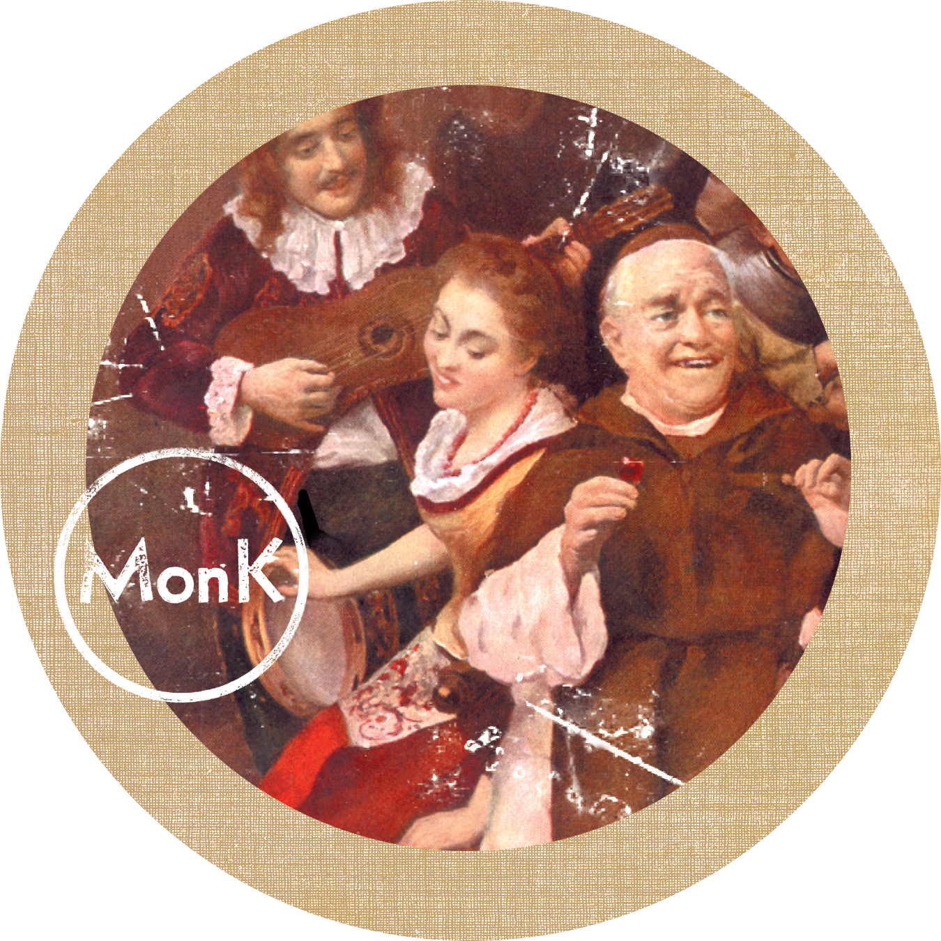
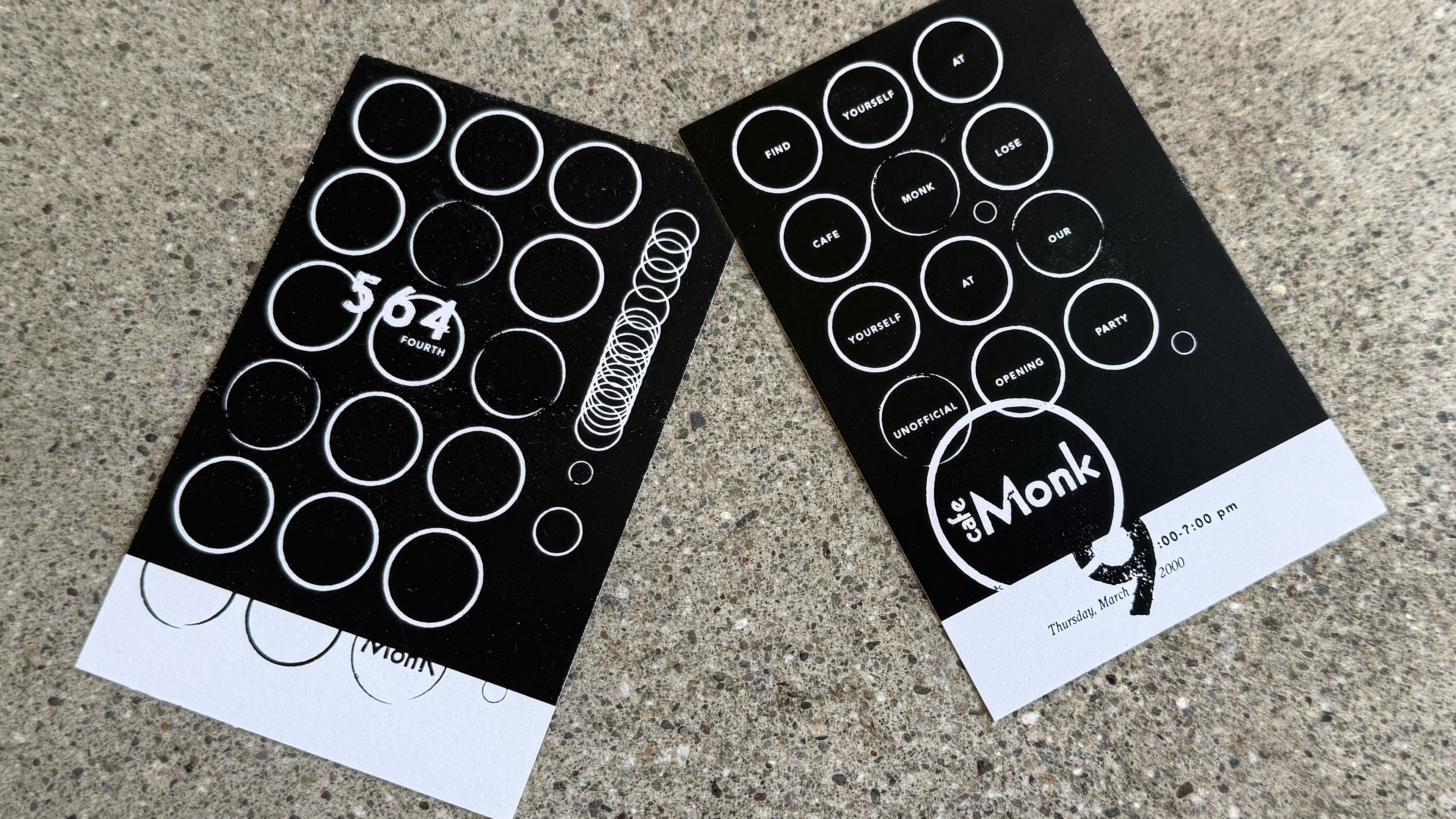
The logo carried past print, too: I extended it into a rotating, mechanical outdoor sign, plasma-cut from steel and backlit, left to rust and weather along with the rest of the identity. For the coasters, I set that same "Monk" mark over two classical genre paintings of monks and revelers at a table: music, wine, and company, playing off the restaurant's name and giving the identity a sense of old-world warmth and hospitality. The same ring-badge system carried through to the business cards, in both a light and a dark colorway, keeping the letterpress feel consistent across every touchpoint.
Credits
John Caponi / Designer / Concept, letterpress typesetting, identity system, and outdoor sign design
Peter Chase / Copywriter