Bandcamp Identity
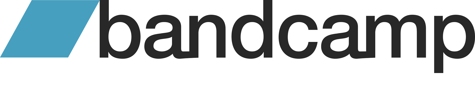
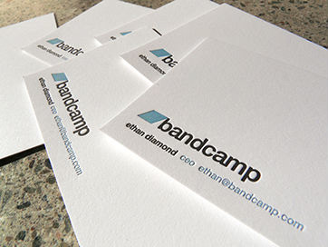
I designed Bandcamp's logo and identity in 2008, right as the platform was getting off the ground, and it's probably the most well-known logo of my design career. I'm grateful I got the opportunity, and proud of what it's become. Longevity like that is its own proof that a design works.
I explored ten distinct directions, but the first concept landed clearly and quickly: a "shelter" concept, a lean-to parallelogram shape paired with a "bandcamp" wordmark. That geometric shape became the small icon that still sits next to the wordmark today. The original wordmark didn't connect any of the letterforms, but after that first round, Ethan Diamond wanted the mark to feel more special and asked me to explore fusing the letters together. Connecting the lowercase "a" into the letters next to it in both "band" and "camp" gave the wordmark real substance, and gave it meaning, too, echoing the connected community Bandcamp was building between artists, labels, and fans. Ethan and Shawn Grunberger were my partners on the branding conversation throughout.
The logo is unchanged since launching in 2008, and it's still getting written about today: design and branding sites point to that same fused-lettering detail as a deliberate piece of craft, and cite the mark's unbroken consistency over close to two decades as a sign the original design got it right.
Credits
John Caponi / Designer / Concept, design, and typography development
Ethan Diamond / Bandcamp Co-Founder & CEO / Creative direction and approval
Shawn Grunberger / Bandcamp Co-Founder / Creative direction and approval