Adobe Originals Poster
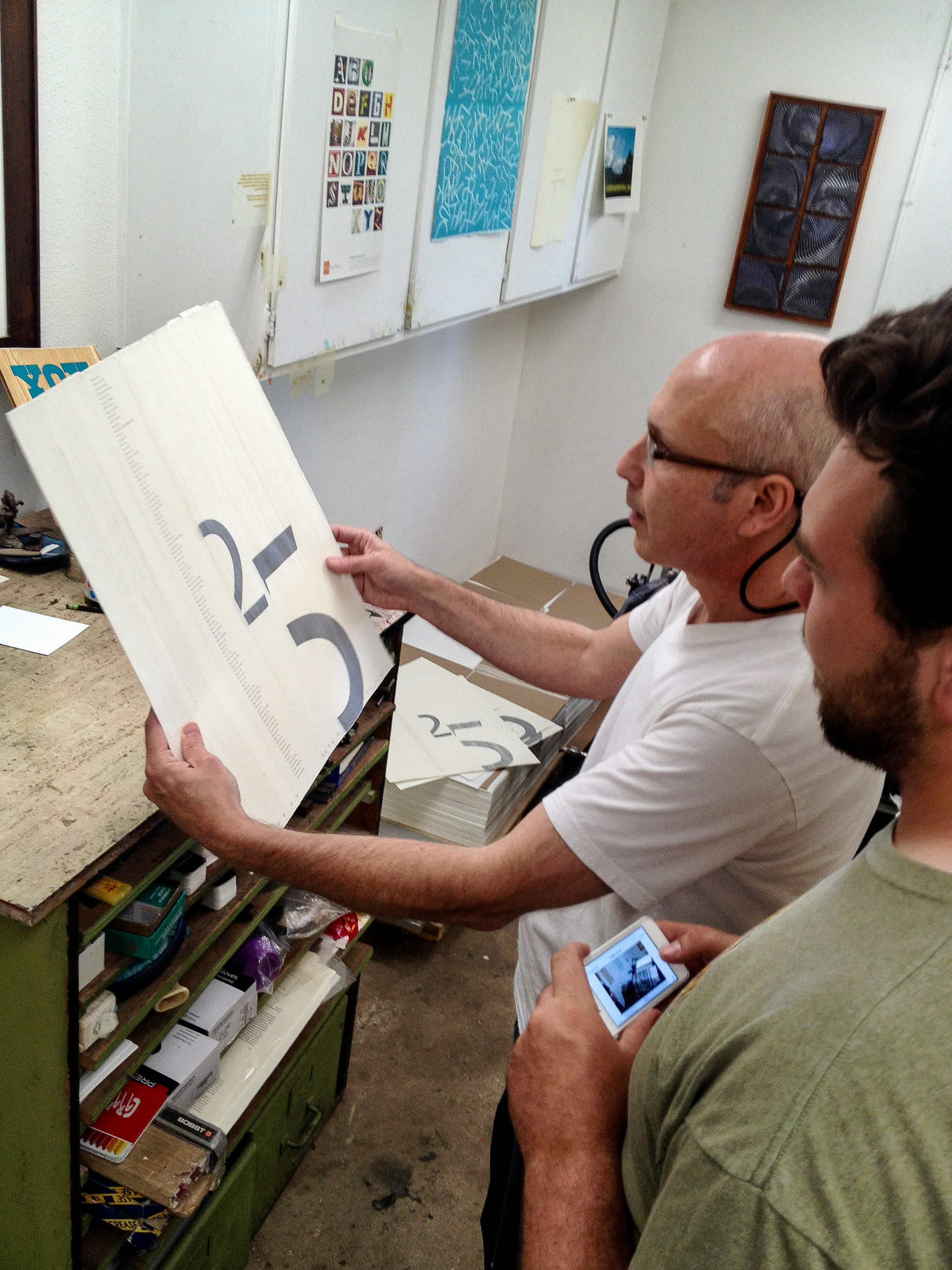
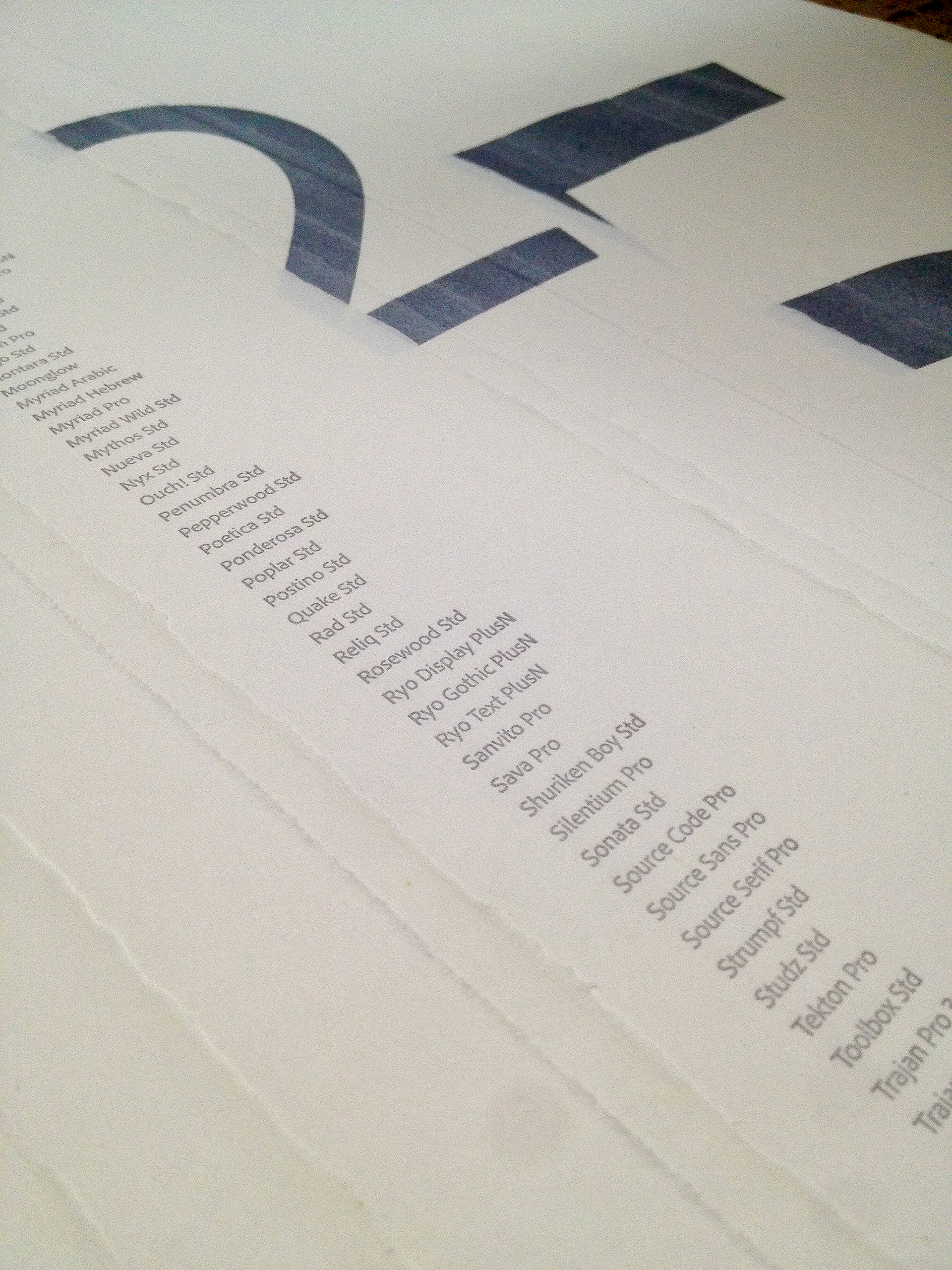
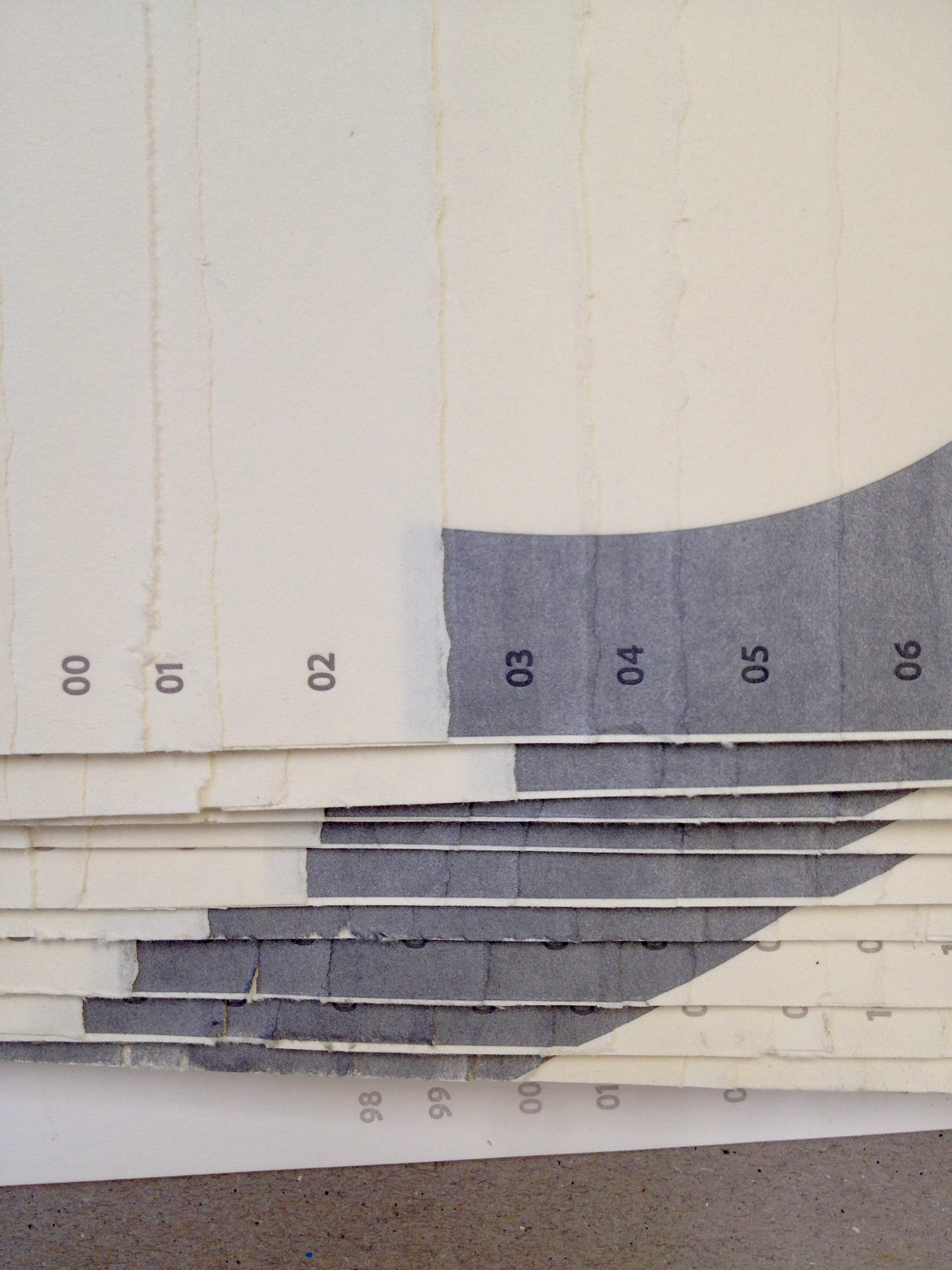
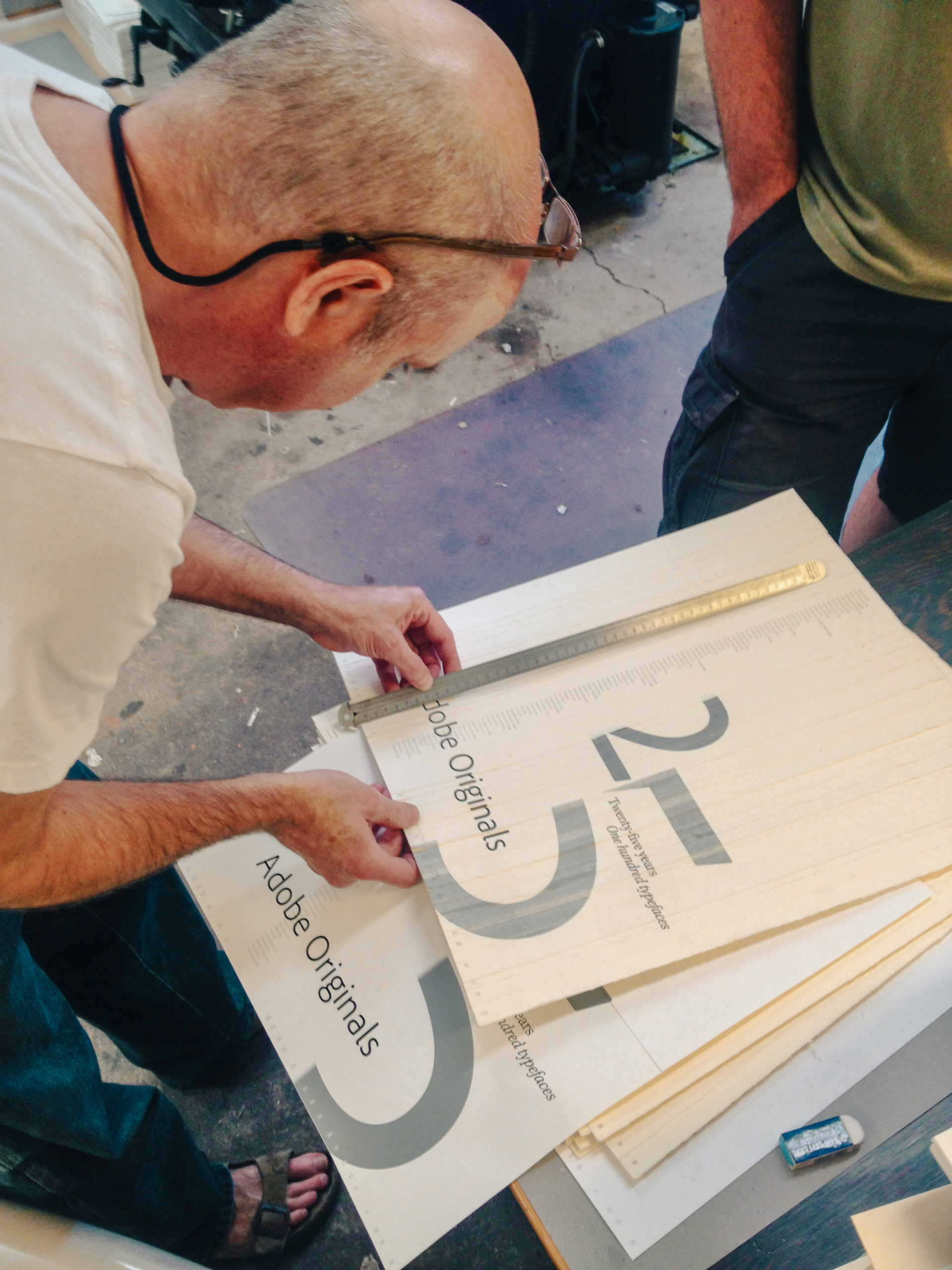
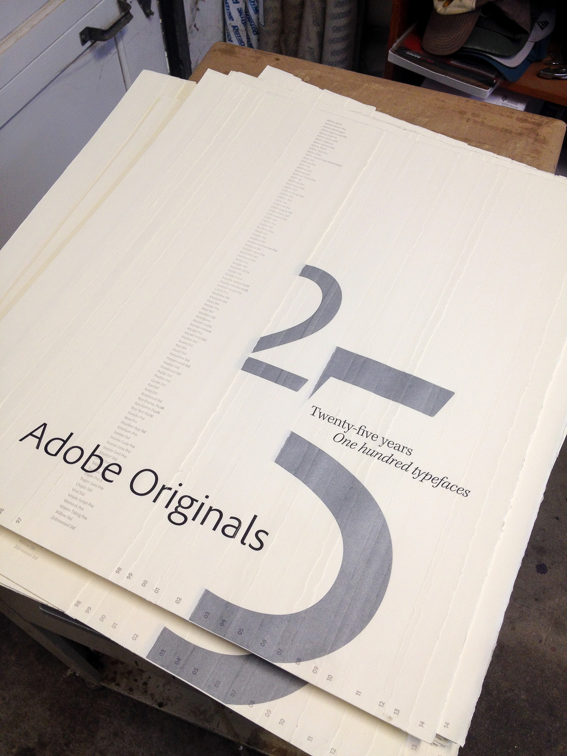
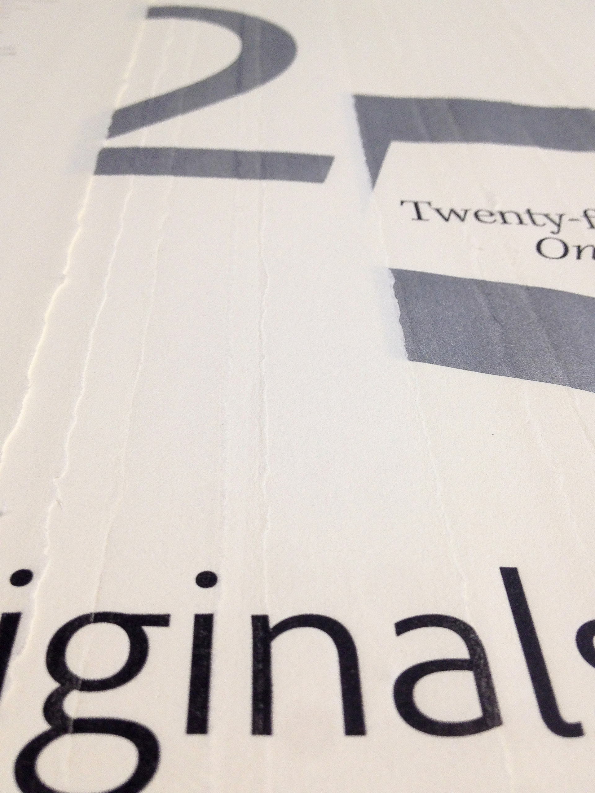
The Adobe Type team asked me to design a limited-edition poster celebrating 25 years of Adobe Original Typefaces. My concept was to visualize the pages of a book, flat and fanned out, with folios that coincided with the 25 years like a timeline, a direct connection to print publishing, but also a visual metaphor for the team's own history. I layered the "25" into those pages to build in a sense of depth: the numerals sat partly on a page and partly jumped off it, breaking apart where they overlapped the pages behind them. Cropping a classic typeface that way gave it a modern aesthetic, a way of speaking to the future and the innovation the type team represented: a team that's always balanced classic typography and font-building craft with digital technology. Every choice in the poster was meant to carry that same layered depth.
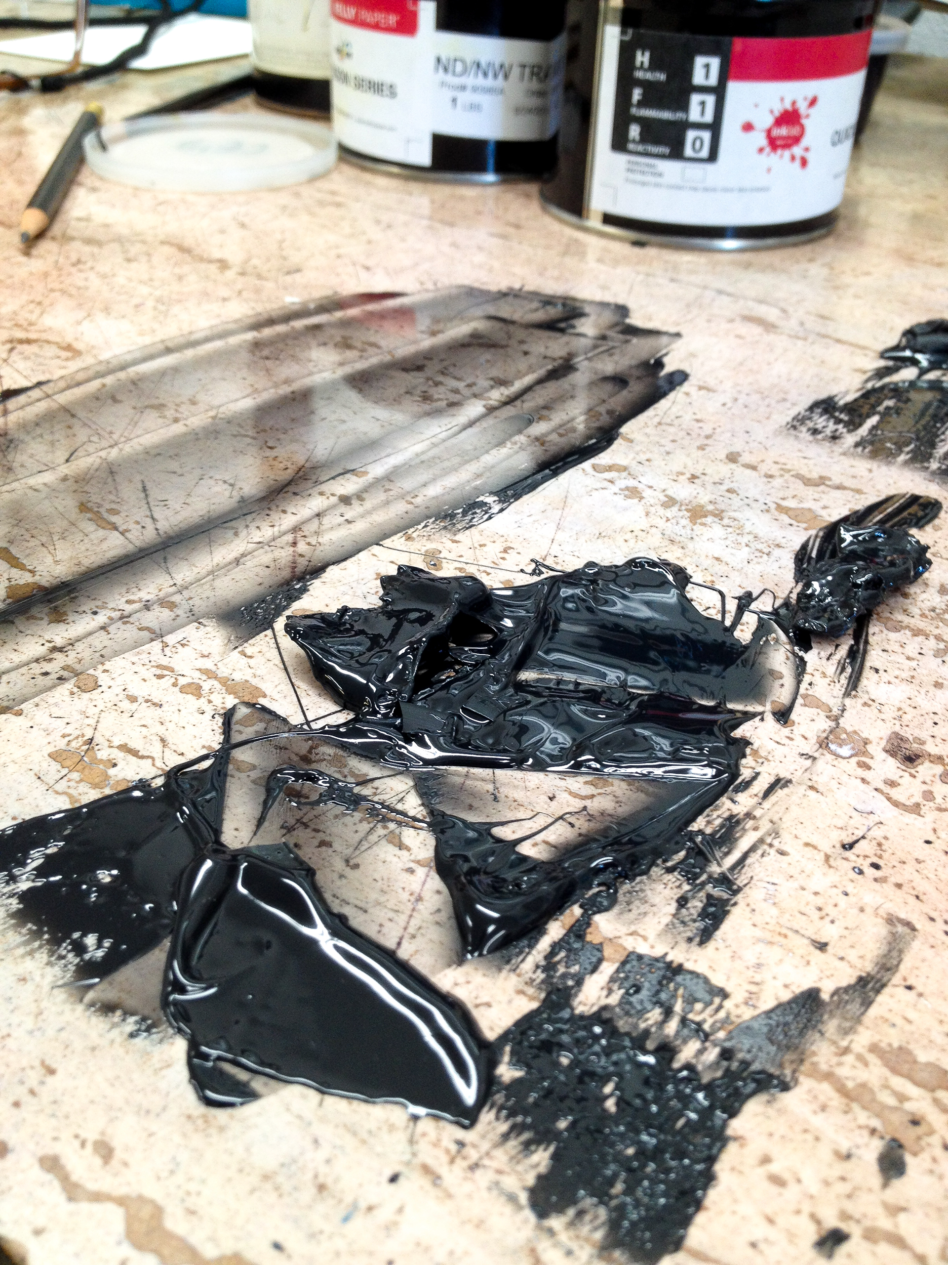
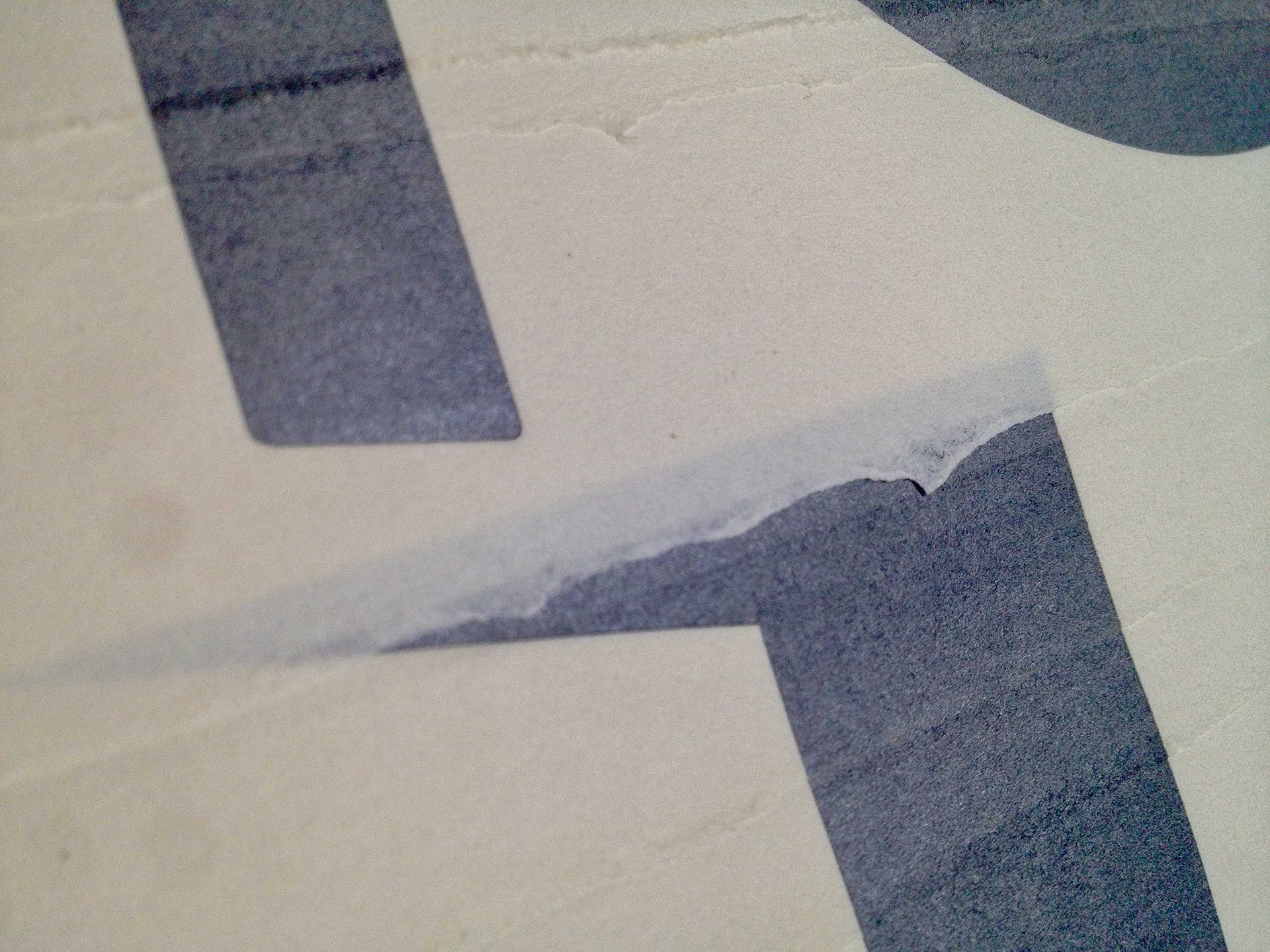
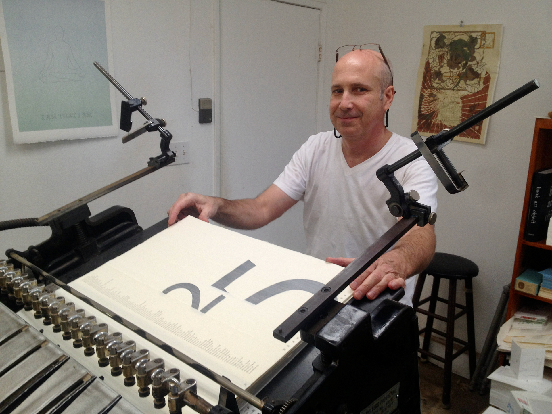
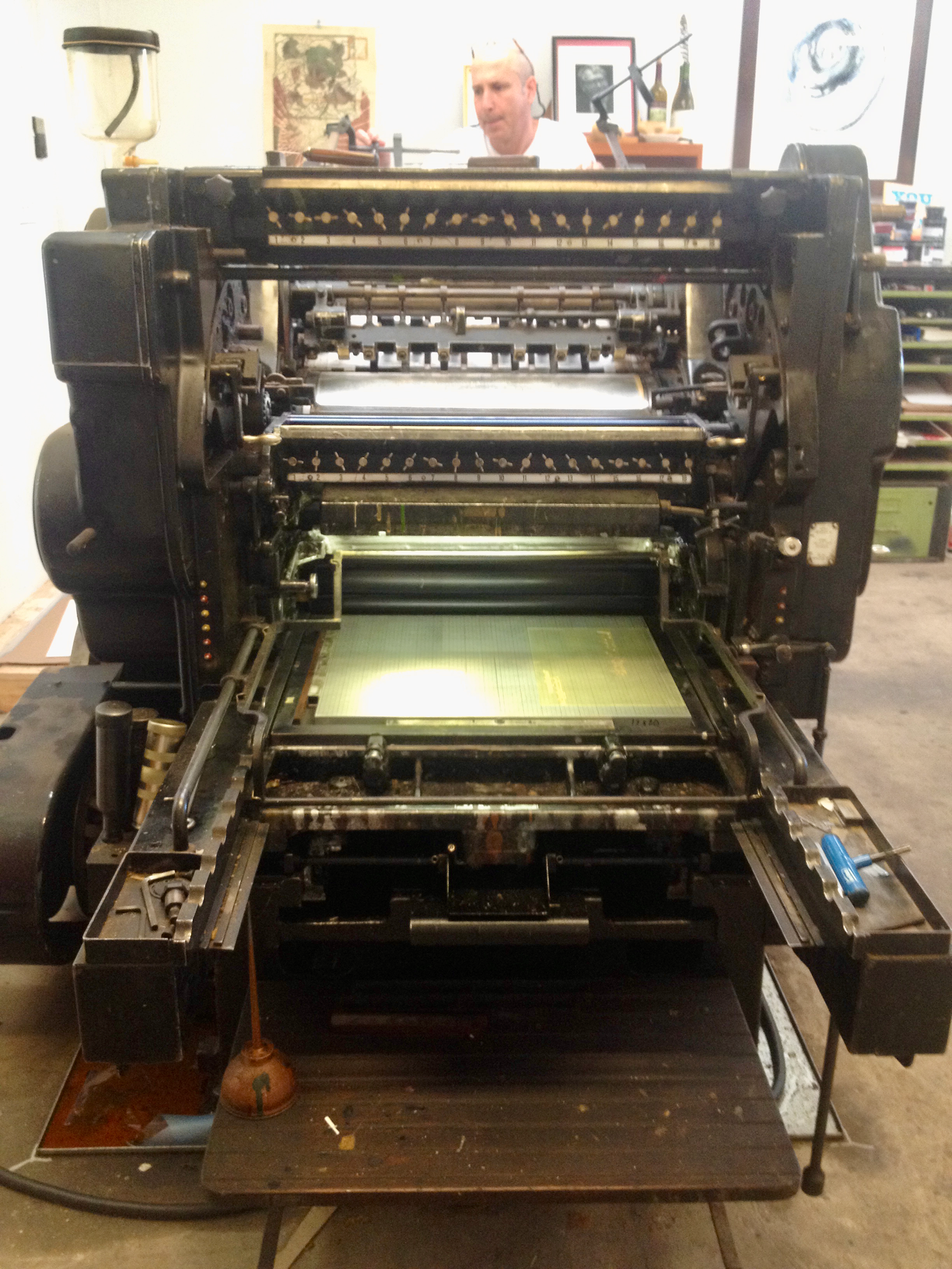
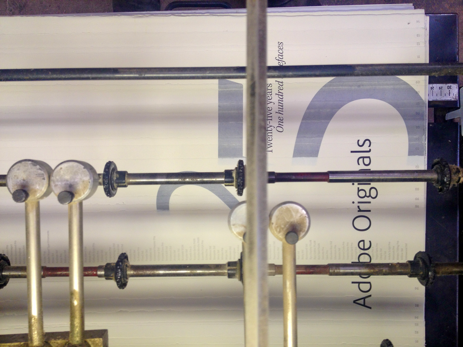
Norman Clayton of Classic Letterpress in Ojai, California, brought the concept to life, and his contribution went beyond printing: he breathed additional life into the design by layering thin strips of paper to represent the years, leaving the deckle edge for texture and giving the piece a physical quality the flat concept didn't have on its own. To get the type to show under each layer, he had to run the built-up sheets through the press multiple times, pure genius on his part. A limited number of the final posters were personally initialed by Carol Twombly, one of Adobe's original type designers.
Credits
John Caponi / Concept, design, and layout
Classic Letterpress / Printing: Norman Clayton
Caleb Belohlavek / Adobe Type
Carol Twombly / Adobe Original Type Designer: initialed a limited number of posters